Editor
The buttons at the top of the page, what each of the four sections sets, and the live preview and final preview
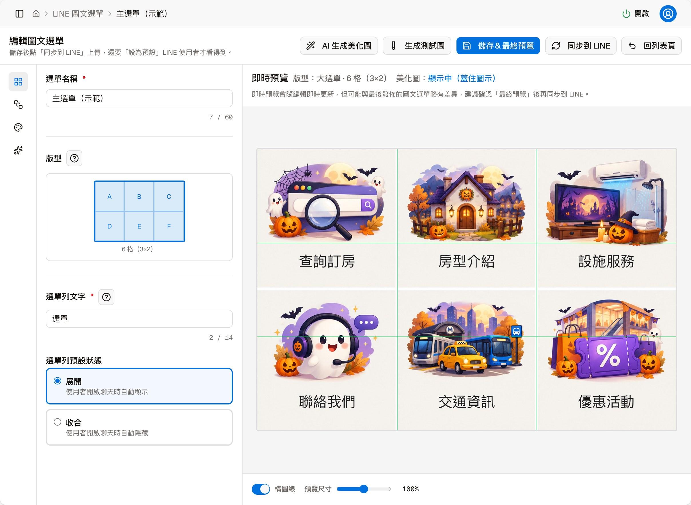
The left side of the editor is a toolbar that splits the settings into four sections; the right side always shows a live preview.
What each of the four sections is for
- Layout — the menu name, the chat bar text, and whether the menu is expanded or collapsed when the chat opens
- Buttons — each cell's icon, label text, and what happens when it is tapped
- Style — the size, color and position of icons and text, the button gap, and the color scheme
- Beautify — apply a beautified image as the background; generating one with AI is on another page
Buttons at the top of the page
| Button | What it does |
|---|---|
| AI-generate beautified image | Opens the AI-generate beautified image page, where you generate this menu's background from a template or your own description |
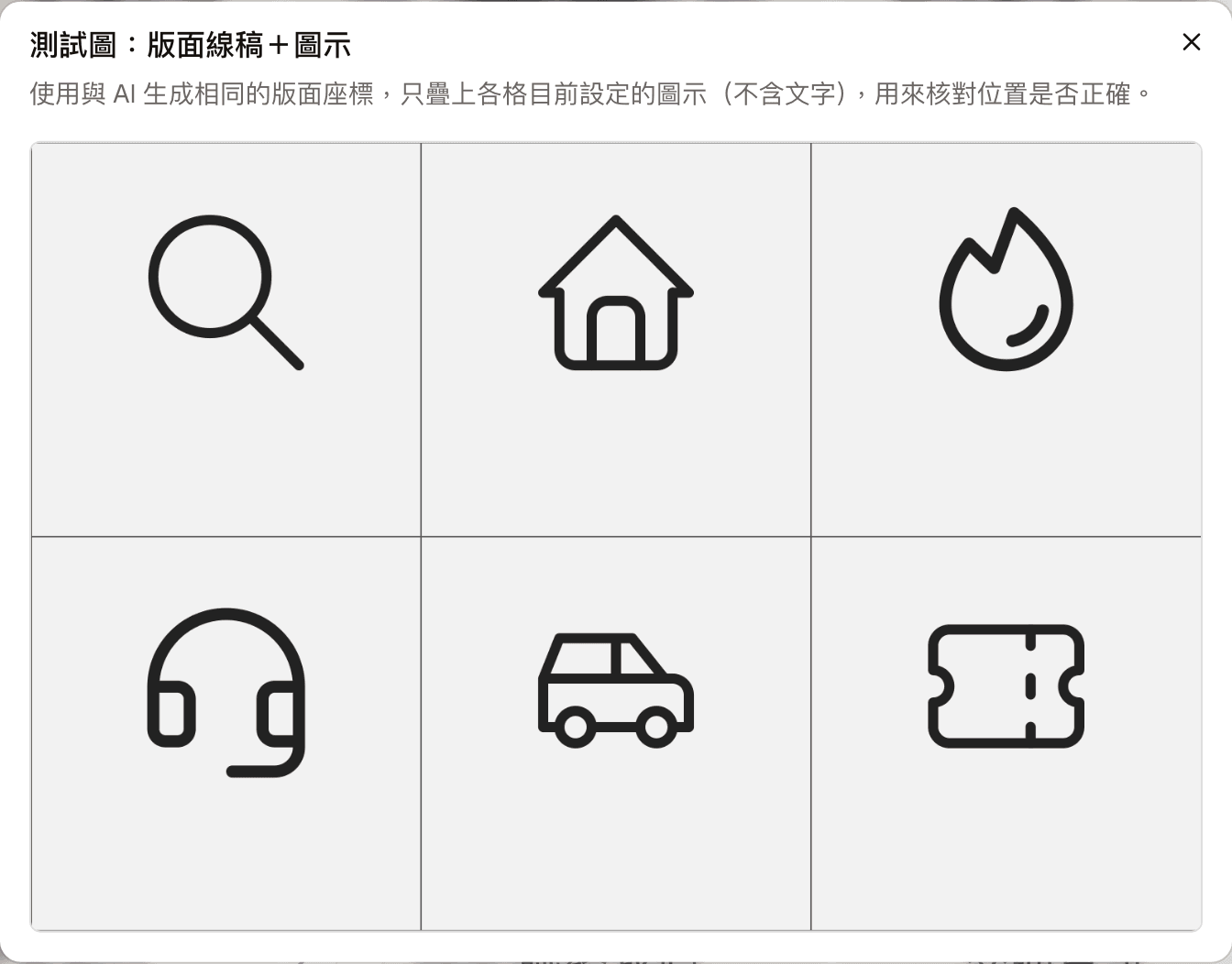
| Generate test image | Produces a test image with only the grid lines and each cell's icon, without text, to check icon positions. It is not saved and does not use any AI generation quota; this is the reference grid image used when generating a beautified image with AI |
| Save and final preview | Saves the current settings and opens "Final output preview" on the right (see "Live preview and final preview" below) |
| Sync to LINE | Uploads the saved content to the LINE Official Account as soon as you click. Same as the action of the same name in the list |
| Back to list | Returns to the rich menu list |
Layout
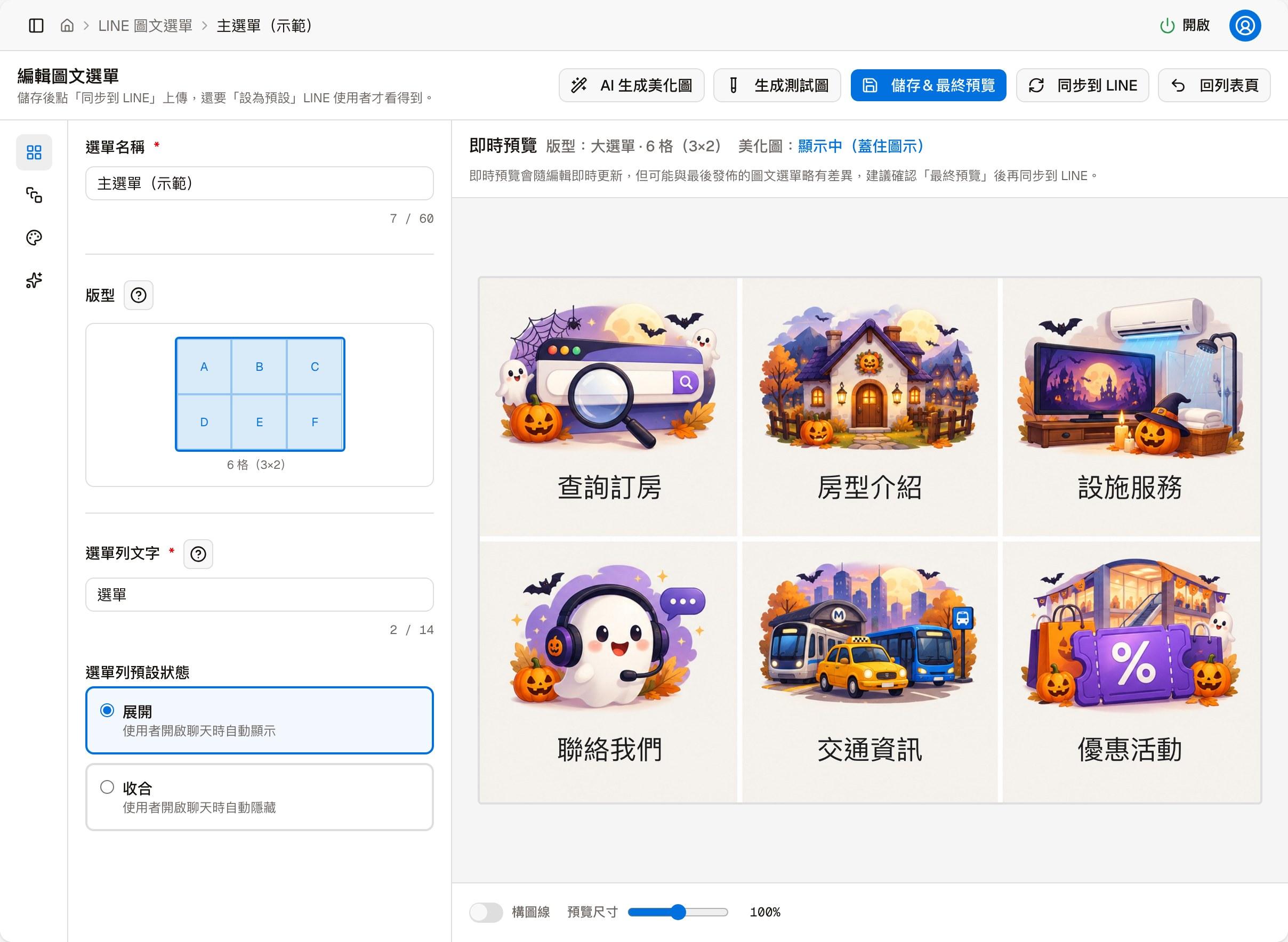
| Field | Description |
|---|---|
| Menu name | Required, up to 60 characters. Only used to identify the menu in the admin; customers do not see it |
| Layout | Read-only; decided when the menu was created |
| Chat bar text | Required, up to 14 characters. The line of hint text at the bottom of the chat |
| Default chat bar state | Expanded (customers see the menu as soon as they open the chat) or Collapsed (they need to open it themselves) |
The "?" next to Layout and Chat bar text shows a short explanation.
Buttons
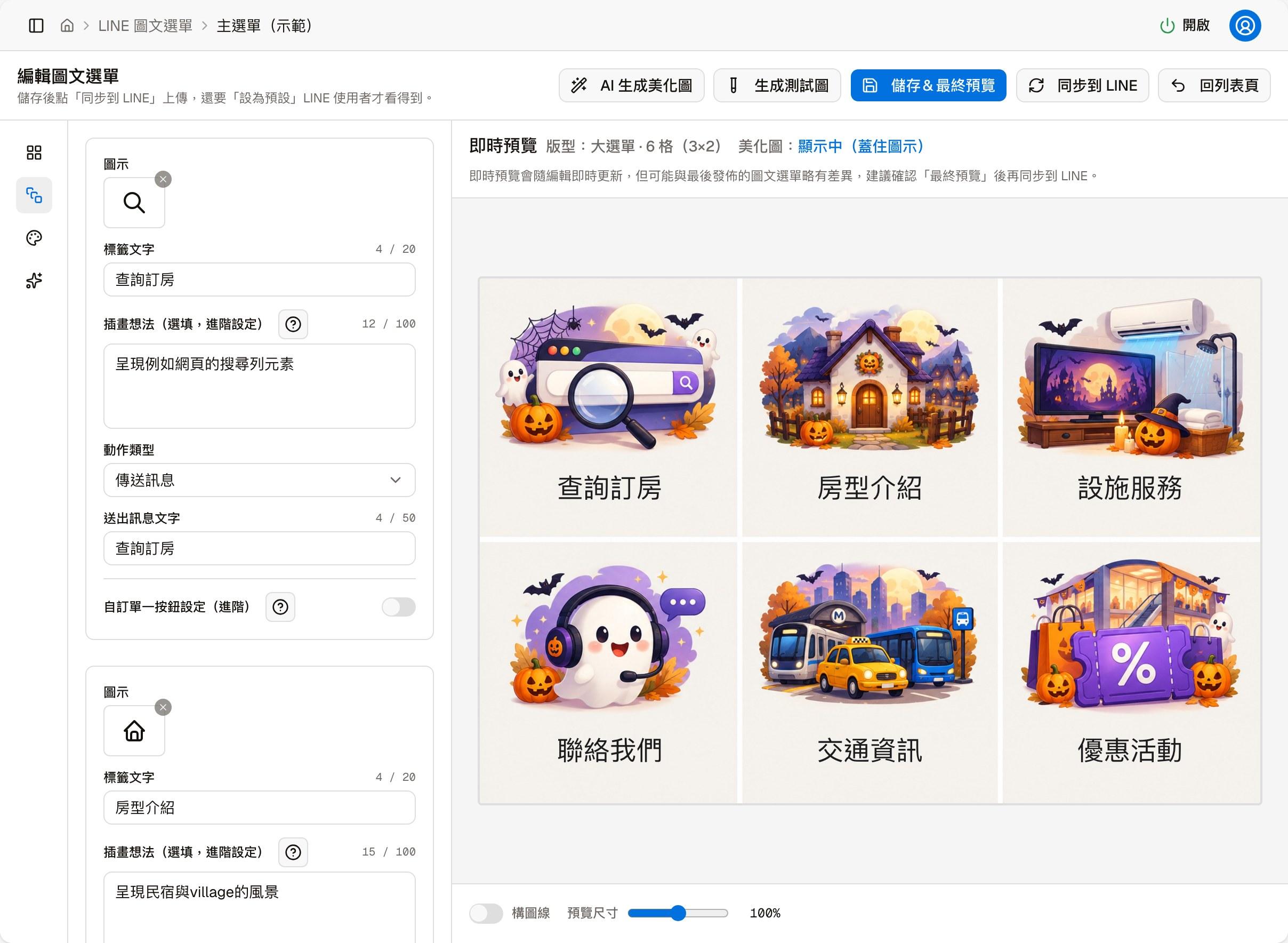
Each cell is set separately, and the number of cells is decided by the layout:
| Field | Description |
|---|---|
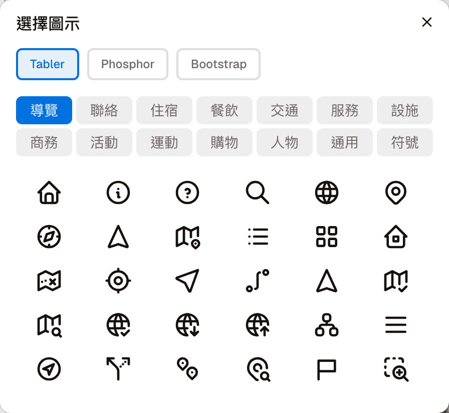
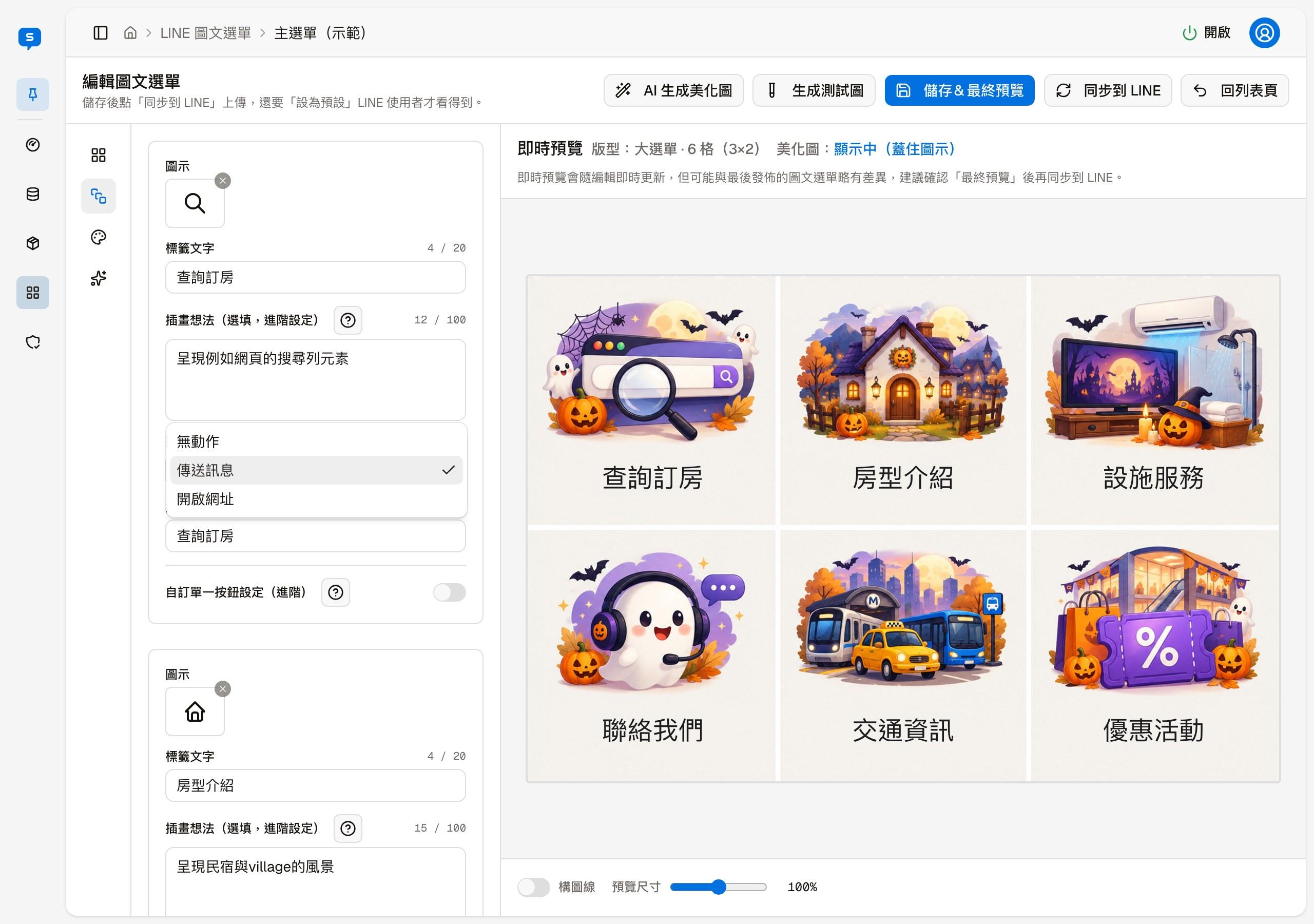
| Icon | Click the icon box to open "Select icon" and choose one; the × at the top right of the icon box clears the current icon |
| Label text | Up to 20 characters, shown next to the icon |
| Illustration idea (optional, advanced) | Up to 100 characters. Only affects the idea used when the AI generates the background image; customers never see it. If left empty, the icon name is used. For how to write it, see Other factors that affect the result |
| Action type | See the table below |
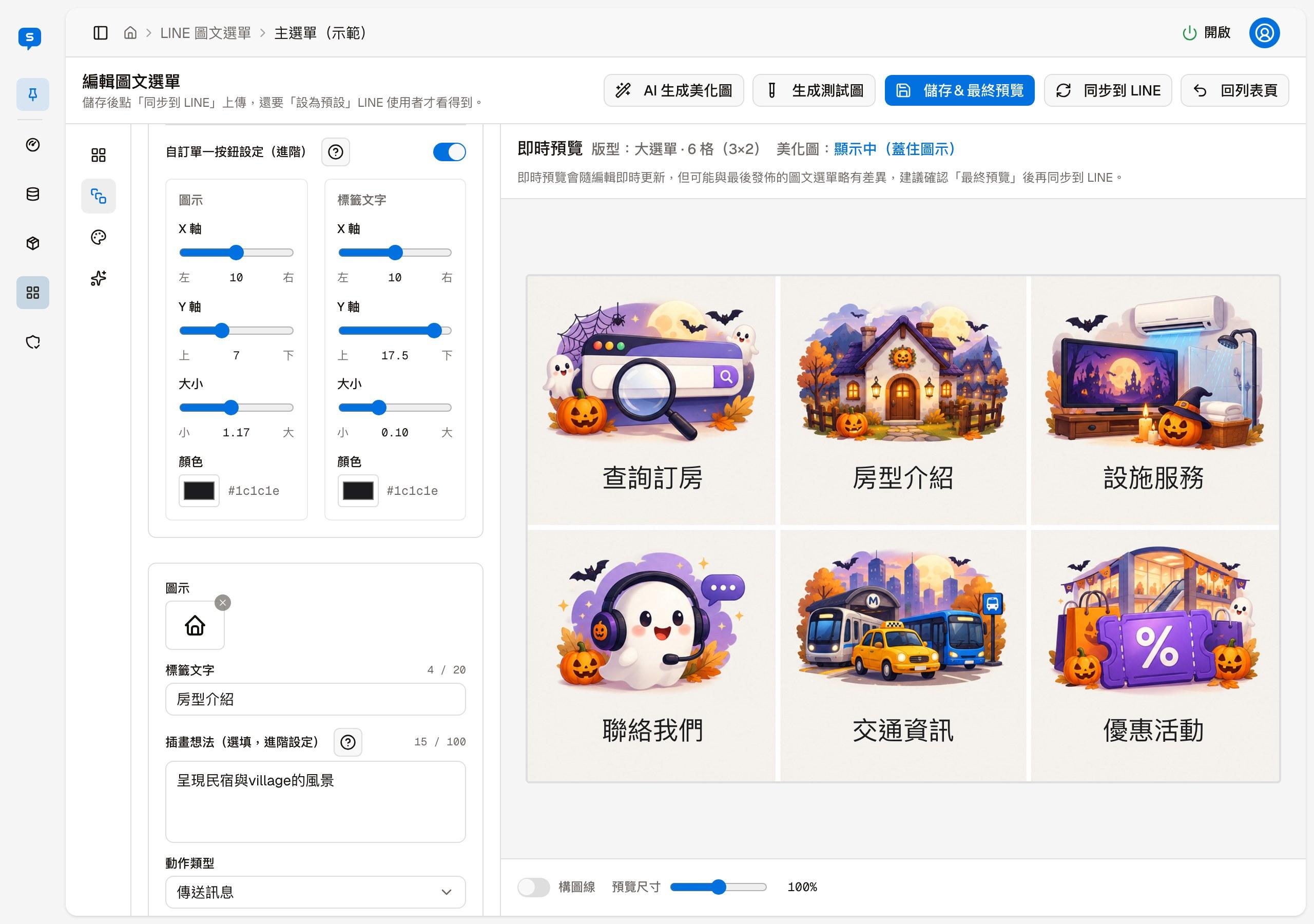
| Custom single-button settings (advanced) | Lets this cell's position and style ignore the overall settings in the "Style" section |
"Select icon" has three icon styles — Tabler, Phosphor and Bootstrap — with more than 1,000 icons ready to use, all licensed for commercial use. Each style is grouped into 14 categories by theme, such as Navigation, Contact, Stay, Food and Transport:
There are three action types:
| Type | When the customer taps it |
|---|---|
| No action | Nothing happens |
| Send message | Sends a message you specify (up to 50 characters) as the customer, and the bot replies to it |
| Open URL | Opens the web page you specify |
With "Custom single-button settings" turned on, this cell's icon and label text each have an X axis, Y axis, size and color you can adjust. If you are not sure what it is for, leave it off.
Style
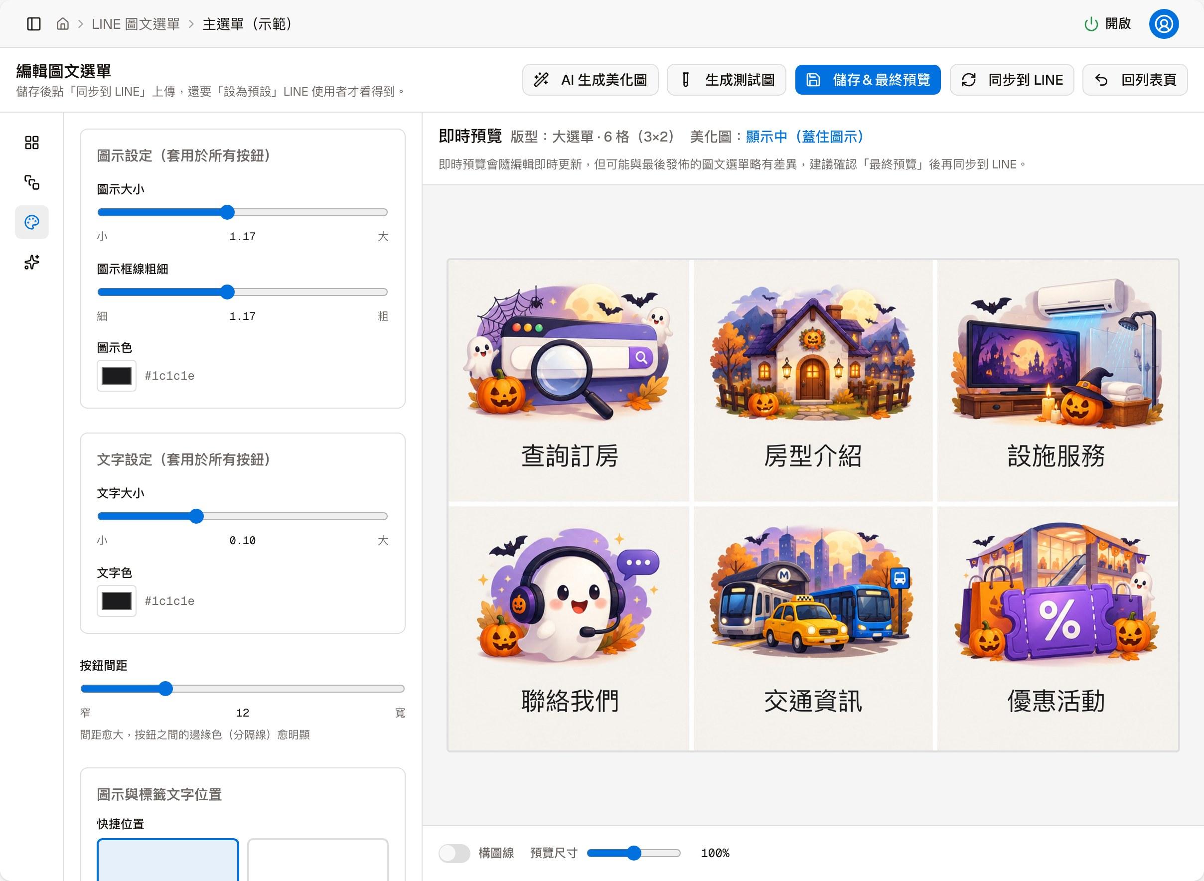
The settings in this section apply to all buttons (unless a cell has "Custom single-button settings" turned on):
- Icons: size, stroke width and color
- Text: size and color
- Button gap: the larger the gap, the more visible the dividing lines between buttons
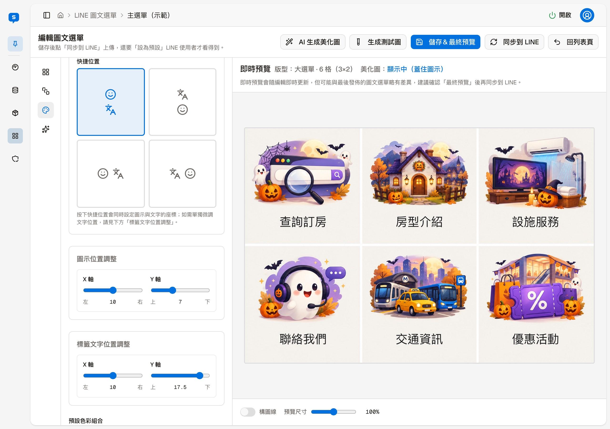
- Position: "Quick position" has four arrangements — icon above, text above, icon on the left, text on the left; clicking one sets the coordinates of both the icon and the text, and you can then fine-tune X / Y separately in "Icon position adjustment" and "Label text position adjustment"
- Colors: "Preset color combos" include Dark (default), Black, Light, LINE Green, Dark blue, Blue, Orange, Purple, Teal and Gold; clicking one applies the divider, button, icon and text colors at once, and you can still fine-tune each afterwards
Beautify
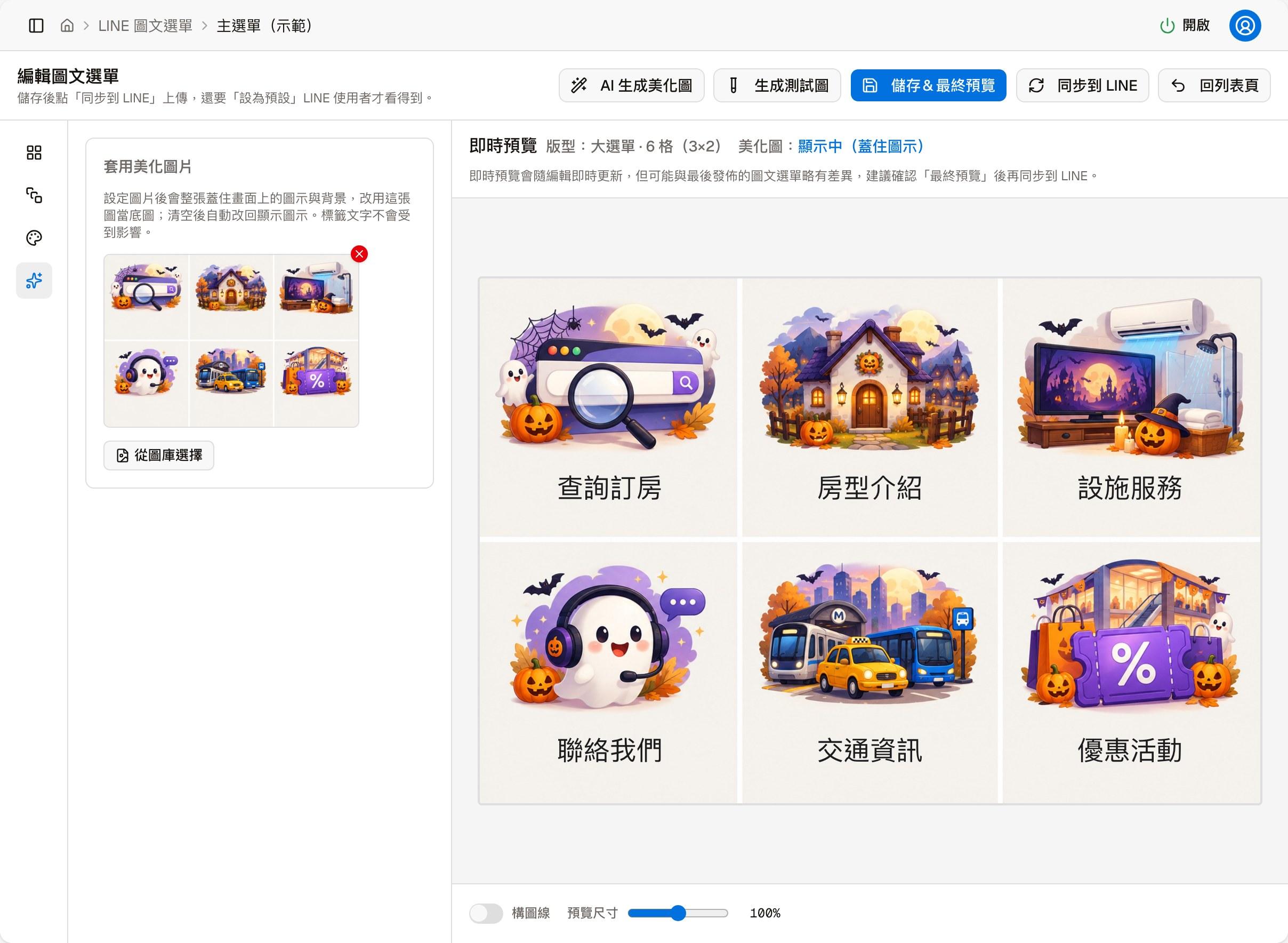
Apply beautify image
Once a background image is set, the whole image covers the icons and background on the screen and is used as the base image instead; click the × at the top right of the background image to clear it, and the icons are shown again automatically. Label text is not affected.
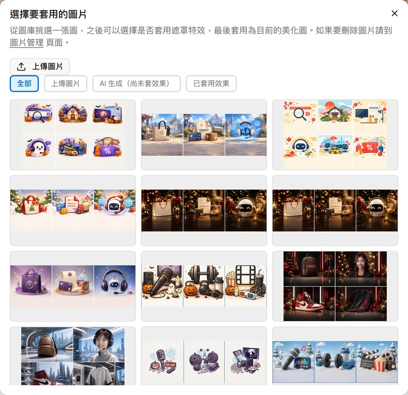
Click "Select from image library" to open "Select an image to apply":
- At the top you can filter by source: All, Uploaded, AI generated (no effect applied), Effect applied
- "Upload image" adds your own images to the library
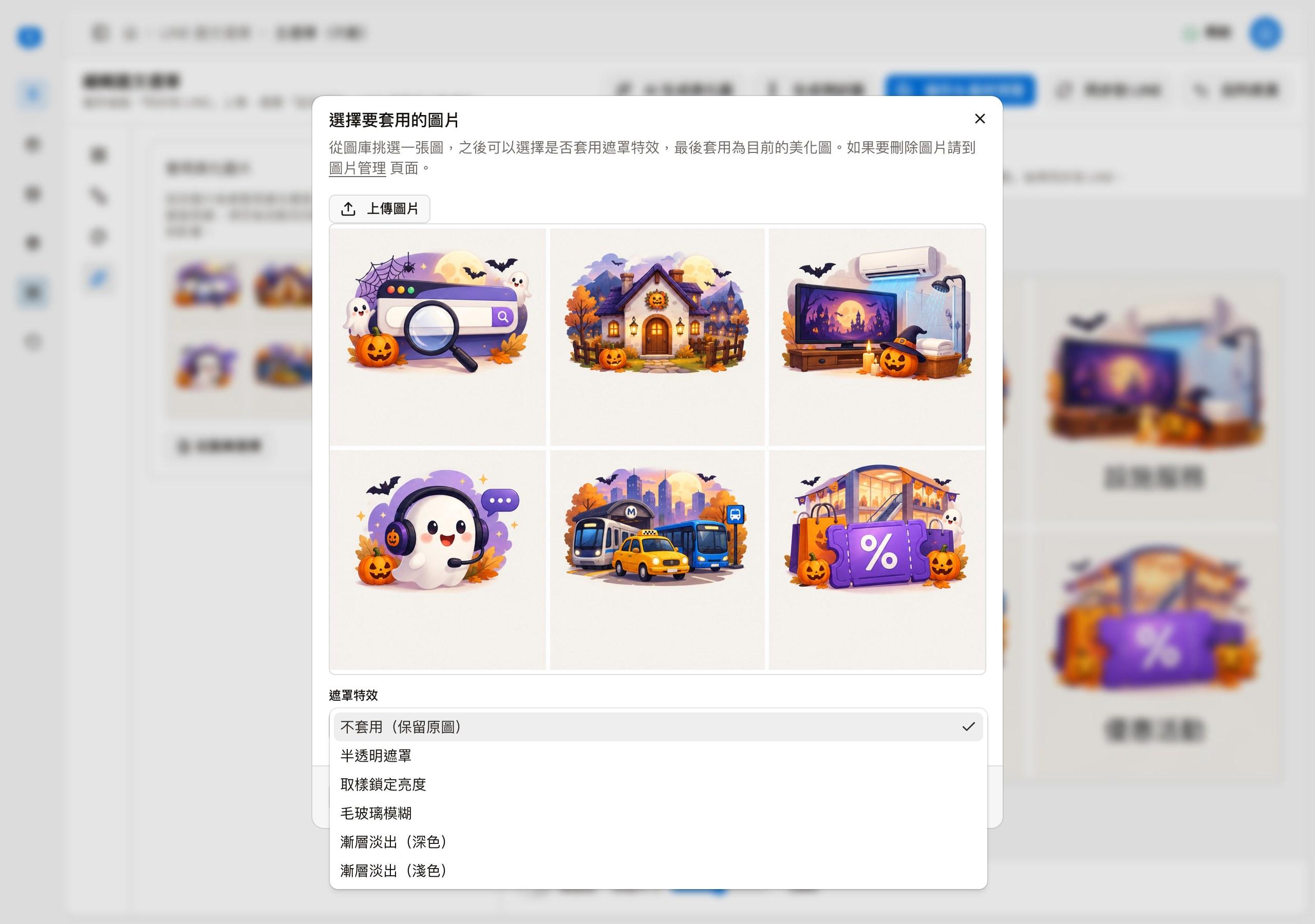
- After selecting an image, you can also choose a "Mask effect": None (keep original), Semi-transparent overlay, Sampled luminance lock, Frosted blur, Gradient fade (dark), Gradient fade (light). Click "Confirm apply" to set it as the background, or "Reselect" to go back to the library
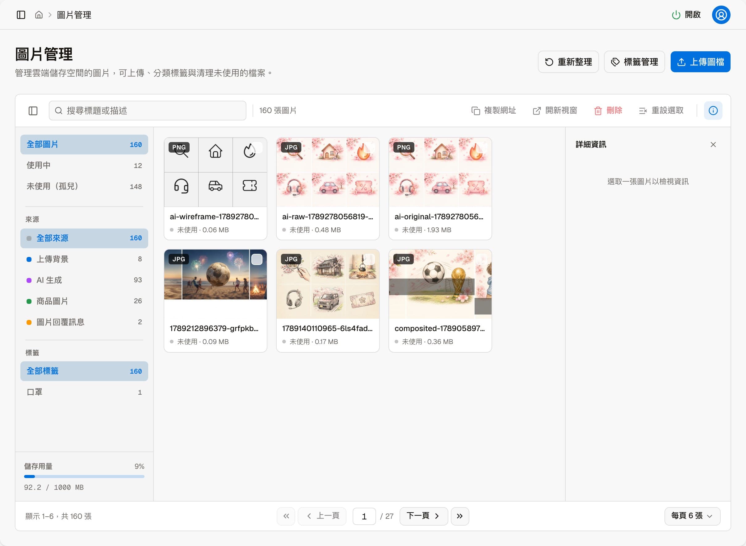
- To delete images from the library, use the "Image management" page linked in the description
The page the "Image management" link opens:
Generating a beautified image with AI
Beautified images can also be generated with AI: click "AI-generate beautified image" at the top of the page; see AI-generate beautified image. Generated images are added to the library; then come back here and use "Select from image library" to apply one.
Live preview and final preview
Please note
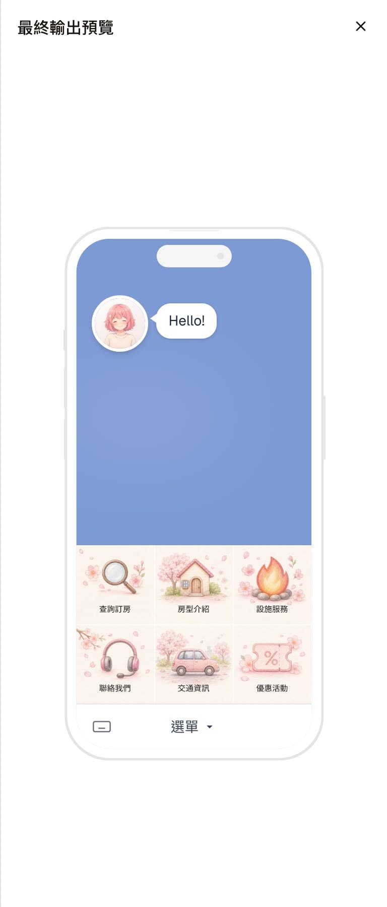
The "Live preview" is a quick preview for interactive editing, but it can differ slightly from the final rich menu. "Final output preview" produces the actual image that is output to LINE, so it is exactly what you see in the LINE mobile app. After editing, compare with "Final output preview" before fine-tuning. Finally, always check how the menu works and looks in the mobile app.
The live preview on the right updates as you edit; the top shows the current layout and whether a beautify image is covering the icons. The "Grid lines" switch below draws guide lines on the preview, and "Preview size" changes the size of the preview.
After clicking "Save and final preview", "Final output preview" opens on the right, showing the final menu image in a LINE chat screen on a phone, with the chat bar text at the bottom.
The final preview is what counts
The live preview and what is finally published to LINE may differ slightly. It is safer to check "Save and final preview" before syncing to LINE.