Home page layout
The order and on/off switches of the store home page sections, and the settings for the three content sections — promo banners, photo gallery and product lists
The store home page is made of sections stacked from top to bottom. This page covers the four store settings sections related to the home page layout.
Content is edited in each section; order and switches are all in "Section order"
- Section order: arranges all the sections on the home page, with switches that decide which sections are shown
- Promo banners, Photo gallery, Product lists: edit the content of these three kinds of sections. New banners and product lists need to be placed in "Section order"
- The content of the other sections is elsewhere: the brand introduction is in "Profile", and there are also "Order rules" and "Coupons"
Every change needs "Save and preview" to save it as a draft, then "Publish" before it appears on the store page customers see; see the overview.
Section order
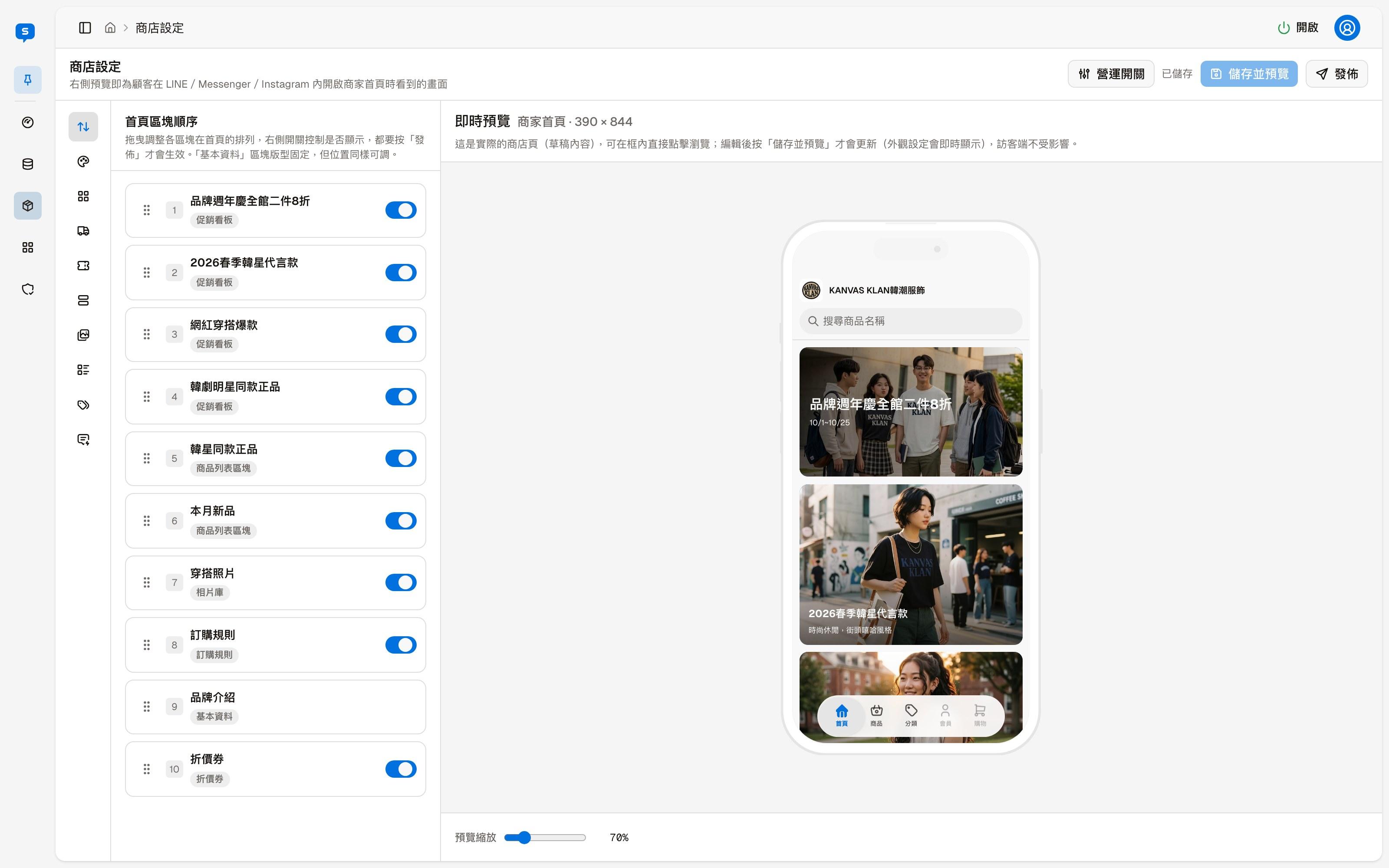
Each row is one section on the home page, showing the section title and type (Promo banner, Product list, Photo gallery, Order rules, Profile, Coupons). Each promo banner and each product list takes its own row, so they can be placed in different positions.
| Action | Description |
|---|---|
| Drag the handle on the left | Changes the order of the section on the home page |
| Switch on the right | Whether this section appears on the home page |
The "Profile" section (the brand introduction) has no switch and a fixed layout, but its position can still be changed.
Promo banners
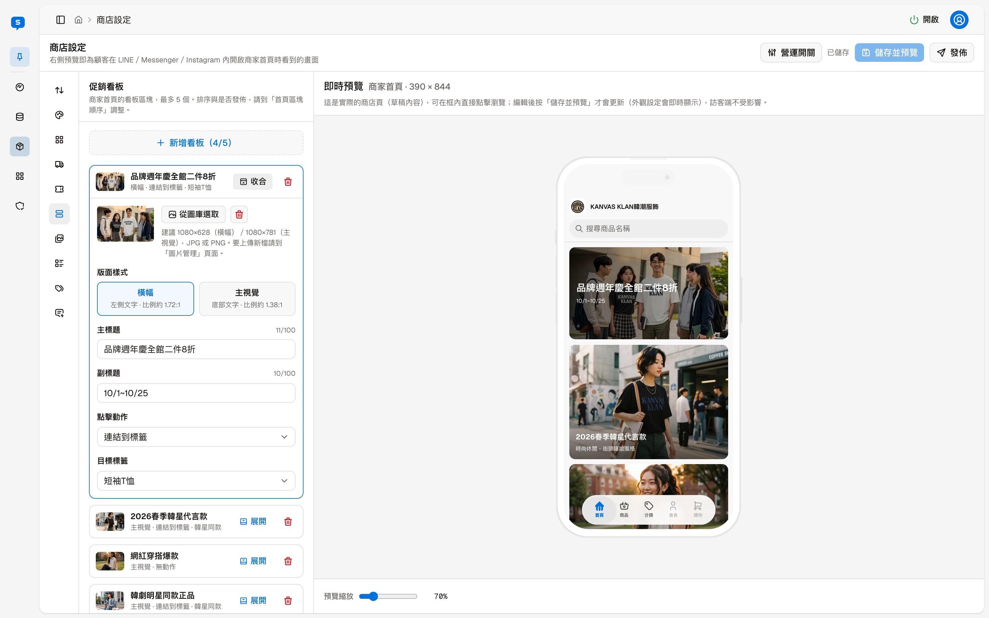
The large image banners on the home page, up to 5. The parentheses on the "Add banner" button show the current count and the limit, for example "4/5".
When collapsed, each banner shows its title and a summary (layout style and tap action). "Expand" edits its content, and the delete icon on the right deletes the banner.
| Field | Description |
|---|---|
| Image | "Choose from image library" picks an image that has already been uploaded. 1080×628 (Banner) or 1080×781 (Hero) is recommended, JPG or PNG |
| Layout style | Banner: text on the left, ratio about 1.72:1. Hero: text at the bottom, ratio about 1.38:1 |
| Title, Subtitle | The text shown on the banner |
| On tap | What happens when a customer taps the banner: No action, Link to a tag, Link to a category, Link to a product, Open a URL, Copy a text message. For example, with "Link to a tag", you then choose the target tag below |
Choose from image library
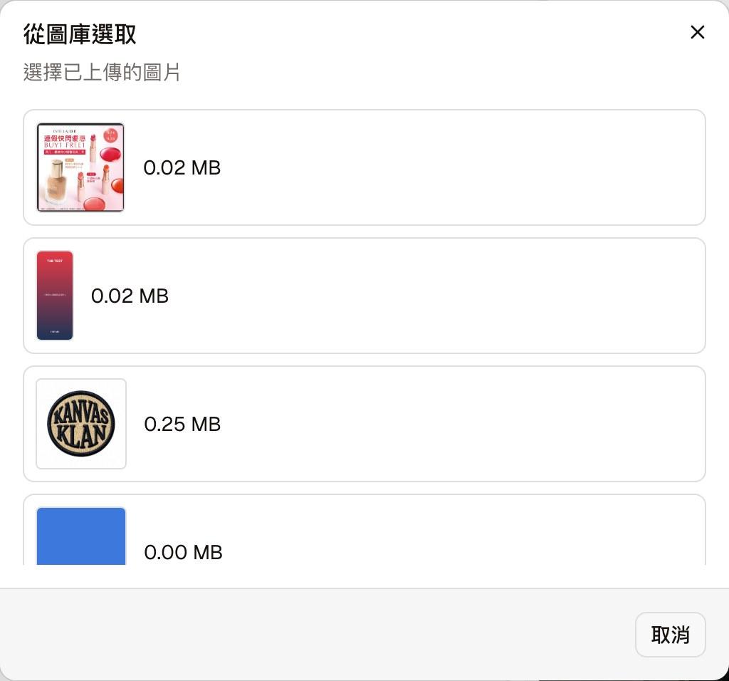
Lists the images already uploaded so you can pick one. You cannot upload new images here; upload them first in Image management. "Add photo from image library" in Photo gallery and the store logo in Profile use this same dialog to pick images.
Photo gallery
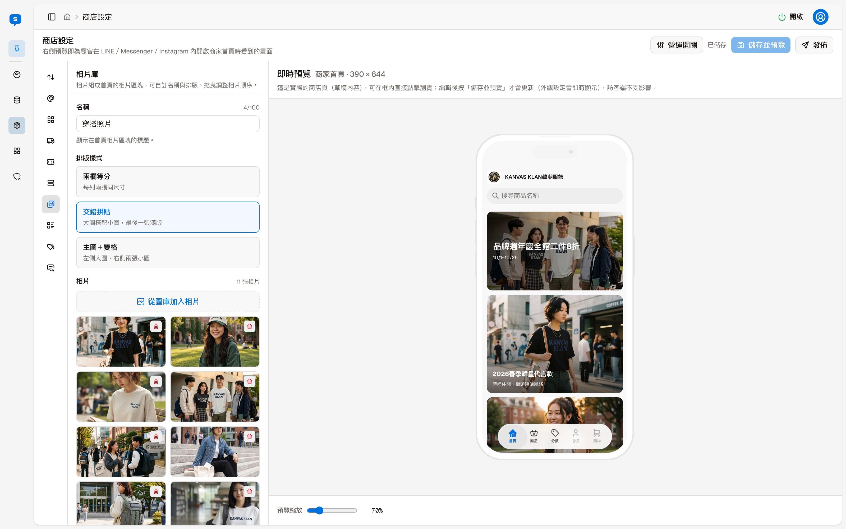
A photo section on the home page: a set of photos with one layout.
| Field | Description |
|---|---|
| Name | The title shown on the home page photo section |
| Layout | Two columns: two photos of the same size per row. Mosaic: large photos mixed with small ones, with the last photo full width. Feature + two: one large photo on the left, two small photos on the right |
| Photos | "Add photo from image library" picks photos from the image library. Drag to reorder photos; the delete icon at the top right of each photo removes it from the gallery |
Product lists
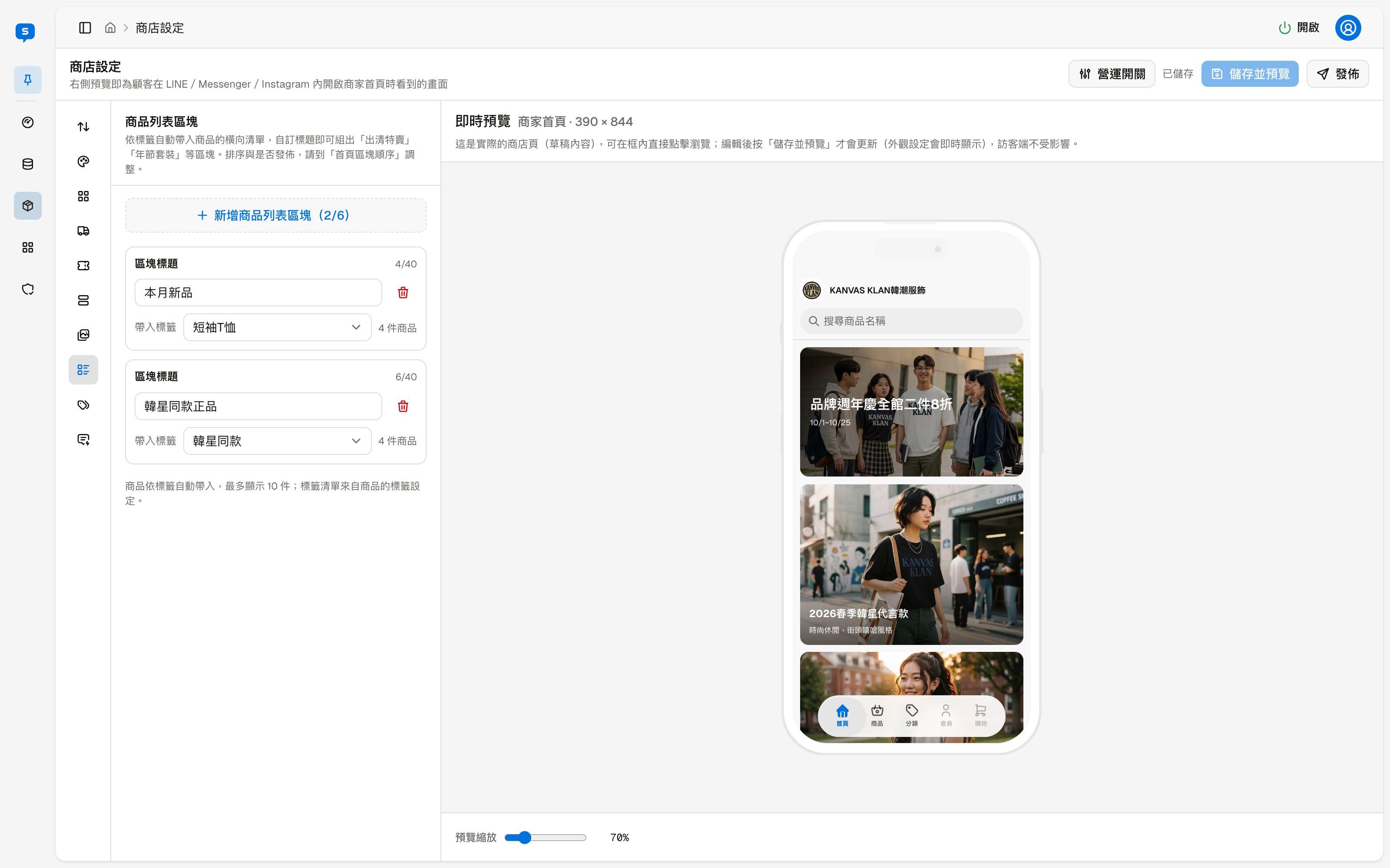
Horizontal lists that fill in products automatically by tag, up to 6 sections. With your own titles you can build sections such as "New this month", "Clearance sale" or "Holiday gift sets" without picking products one by one.
| Field | Description |
|---|---|
| Section title | The section title shown on the home page |
| Tag | Choose a tag; products with this tag are listed in the section automatically. The number of matching products is shown on the right |
Each section shows up to 10 products. The tag list comes from the products' tag settings, which you set in the product editor. The delete icon on the right deletes the section.